spatial IIA
Monday, 6 April 2015
Changes from Presentation
·
I have changed the interior of
the house space. There is now less gaps and thicker walls.
·
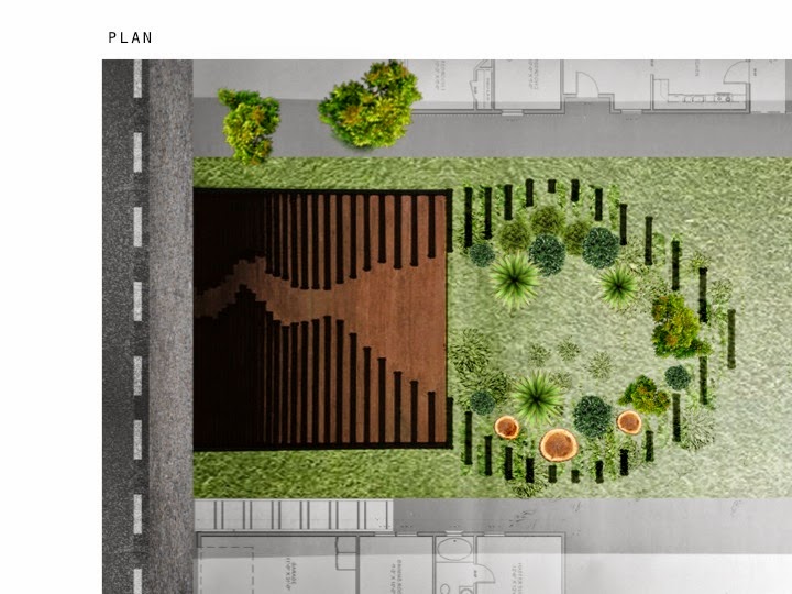
The exit of the tunnel space is
orientated to the right hand-side rather than central
·
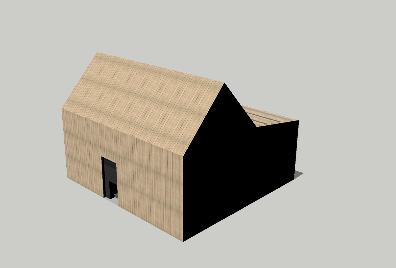
The tunnel itself has changed
shaped slightly and I have completely remodeled this part of the house in
sketch up
·
I have given all my images a
‘wash through’
·
The outside spacious area now
has no walls, but the shrubs and trees create privacy for the space giving a
boarder of the space
·
I have added in plant/grass
covered seating furniture to the outside space that shape nicely with a bone
structure and feel disjointed and bone like
·
I have also added more trees
and shrubs to the outside space
·
I have taken photographs of my
sister and photo shopped these into my finals to help with size and
perspectives. It also shows that the tunnel is difficult to get through
·
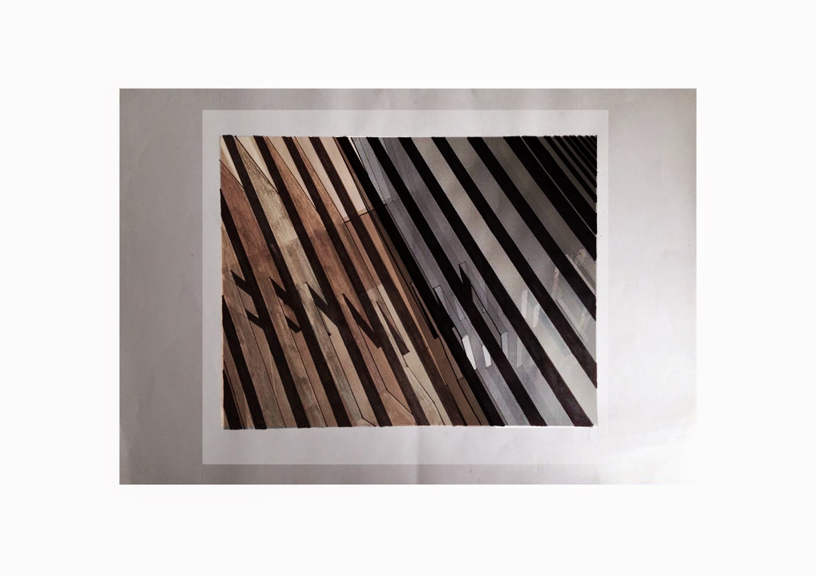
From the front to the back
through the tunnel, the walls change in gradient from a black through to
lighter greys
·
From the outside back to the
front through the tunnel these walls are all wooden
Response to Presentation
In my Presentation I was informed of a few areas in my work that needed to be changed and/or needed improvement. From the feedback I was told to change the thickness of the walls and keep the gaps between the walls the same thickness, so the other way round to what they were. In conjunction to this they would like to see the walls go from thick to thin. My key perspectives could have done with a few more people incorporated into them. They would have liked to have seen the awkwardness of the tunnel and suggested to photograph someone in awkward positions as they can be hard to find. All my finals need a 'wash through' which I was already aware of as I wasn't completely satisfied with what I presented. The outside, organic, open space needs to be made more comfortable, suggestion was to add some furniture. The outside space feels almost sculptor like, which isn't necessarily a bad thing but thats just the feel it gives. The plan was placed into a not so great surrounding for its context.
To start with in response to this constructive feedback I have gone back to sketch up and changed my model. I have completely gotten rid of the outside walls and will photoshop in some other objects to create a distinctive area. I don't know if this was the right thing to do with culling the whole of the outside and starting it again, but I feel without changing it I wouldn't have improved my work all that much and wanted to create a comfortable, non-sculptor like space.
To start with in response to this constructive feedback I have gone back to sketch up and changed my model. I have completely gotten rid of the outside walls and will photoshop in some other objects to create a distinctive area. I don't know if this was the right thing to do with culling the whole of the outside and starting it again, but I feel without changing it I wouldn't have improved my work all that much and wanted to create a comfortable, non-sculptor like space.
I will now go through and photoshop into all of the images. If I had time and availability to an A3 printer than I would have printed them all again and drawn into them before photoshopping. Because of this I have coloured the spaces walls to my liking rather than doing this with pencil.
Monday, 23 March 2015
Subscribe to:
Comments (Atom)


